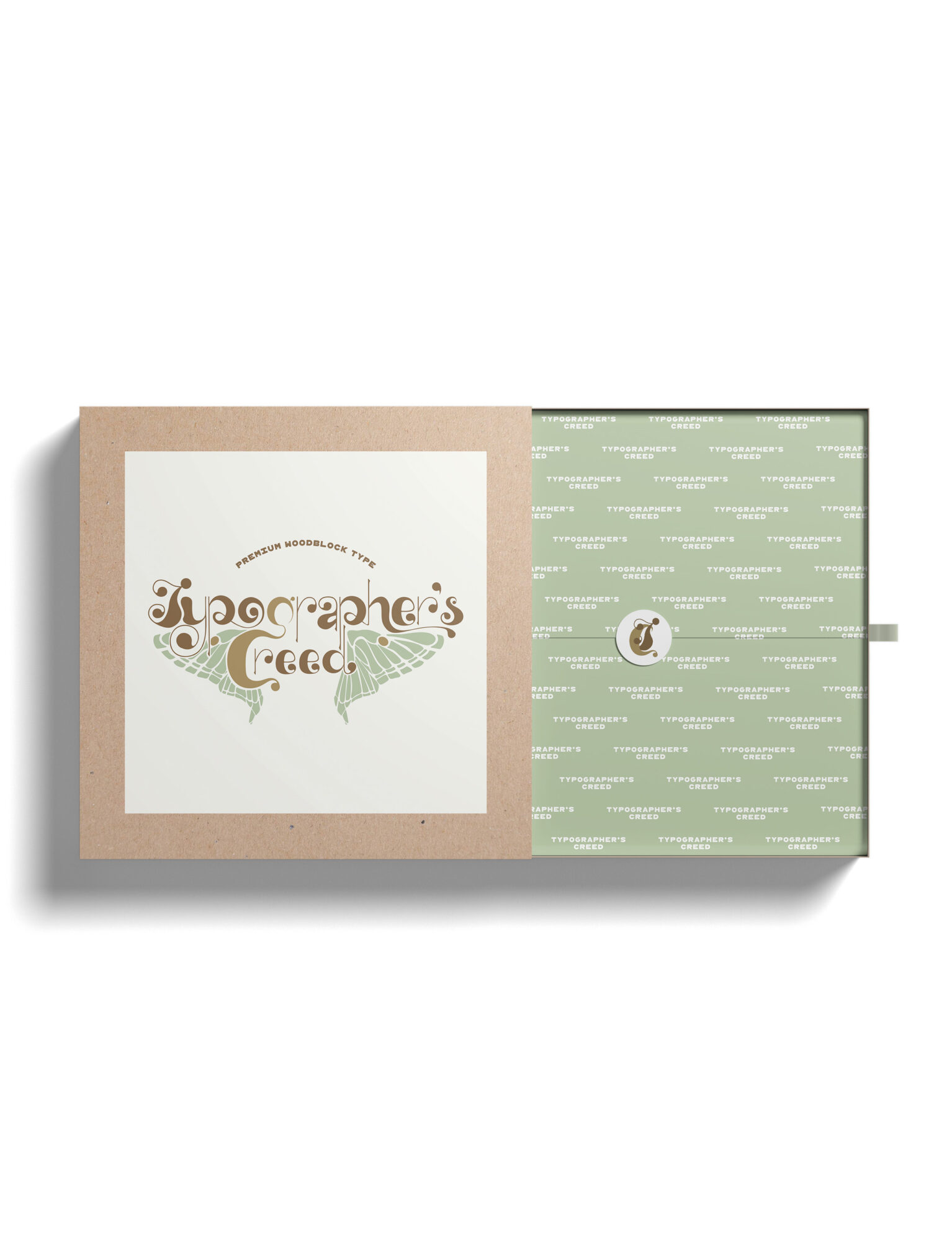
This is a wordmark designed to go on the packaging for a woodblock type company. I was inspired by the spanish moon moth for this peice, which is where the wings and color scheme came from. “Premium woodblock type” is in a typeface that is a copy of a real woodblock type.
Typographer’s Creed
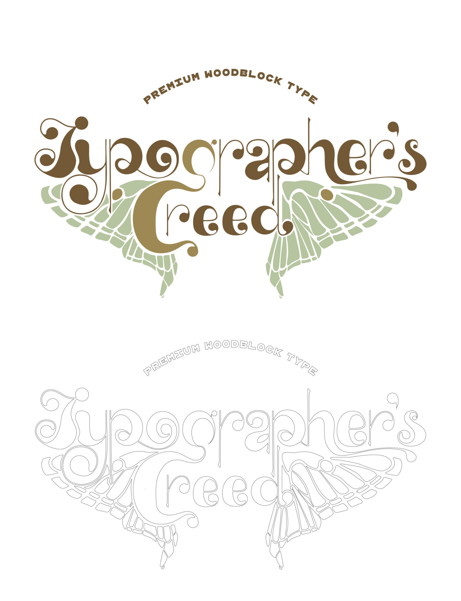

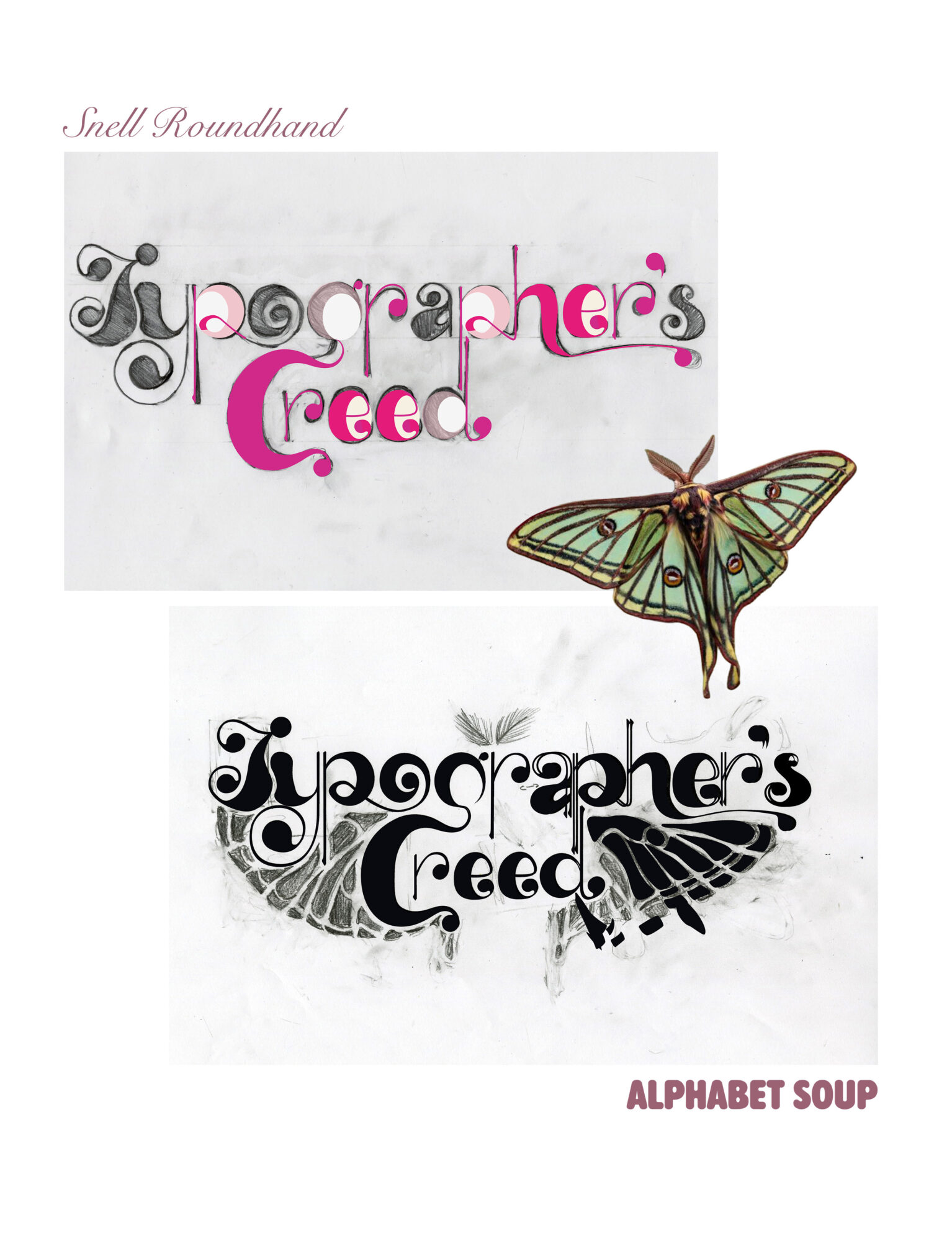
The development of this piece started with two different typefaces, Alphabet Soup and Snell Roundhand. I combined them to make four different designs and then pushed my favorite as far as it would go. After pushing the contrast and weight of my design, I found the base of what I would use for the final “Typographer’s Creed”. Then, I scanned the sketch and made the vectors in Illustrator.
Development